
Gemini 3 Pro Preview vs. 6 AI models: UI Dashboard Design

We tested 7 AI models (including Gemini 3 Pro Preview released yesterday and Grok 4.1, which was released a day before Gemini 3) for a semi-complicated UI task: Build a beautiful and functional dashboard using sample data.
Models tested: Gemini 3 Pro Preview, Claude Sonnet 4.5, Grok 4.1, Grok Code Fast 1, GPT-5.1-Codex, MiniMax M2, Gemini 2.5 Pro.
The Experiment: Build a beautiful & functional UI dashboard
We tested all 7 AI models on the same task: build an analytics dashboard for an AI code editor.
We wanted the dashboard to have some data, so we provided 4 sample metrics for it in the prompt, as well as chart data showing model usage distribution over 7 days.
We then told the models to “Use your creativity to make this beautiful and functional.”
All models used Next.js 15, React 19, and Tailwind CSS v4. Same stack, same data. The results were quite different, however.
The results: 2 out of 7 models failed due to Tailwind v4 knowledge cutoff (29% failure rate). They used outdated Tailwind v3 syntax, which produced unstyled dashboards. One additional model (MiniMax M2) partially failed with broken padding but had working colors and charts.
Let’s dive deeper.
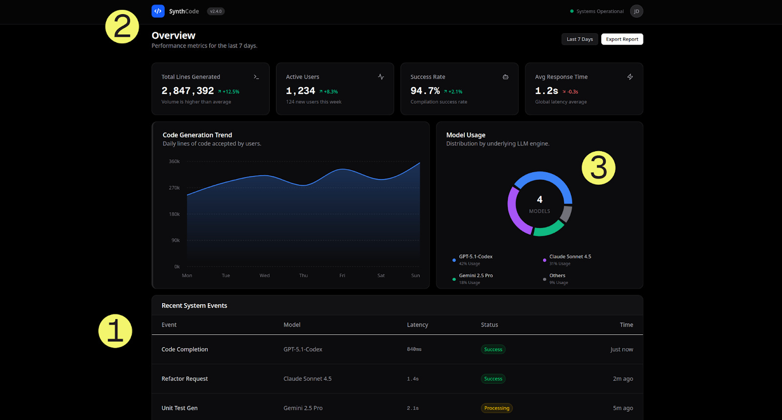
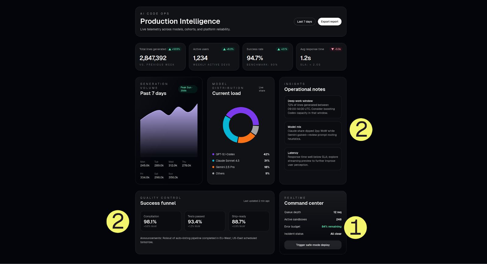
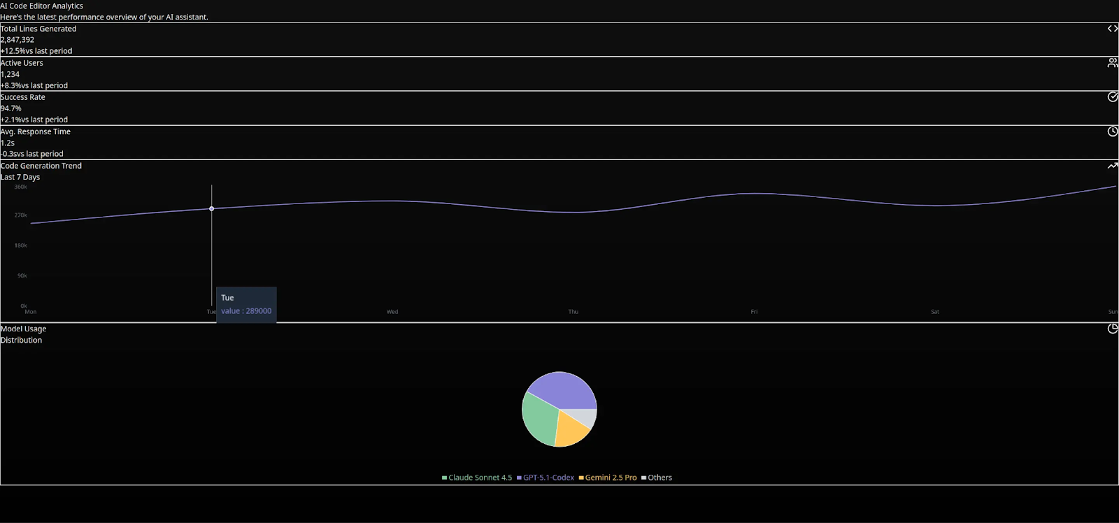
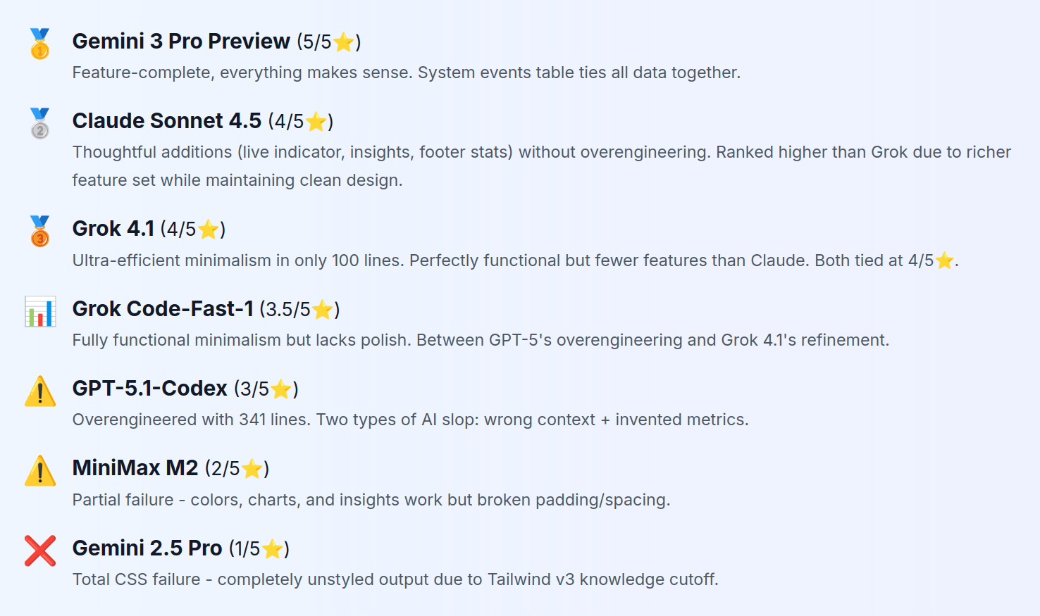
#1 place: Gemini 3 Pro Preview
Google’s latest model added context on top of adding the features we asked for.
What we liked about this dashboard
1. The “Recent System Events” Table
The standout feature was a live activity feed (look at the “Recent System Events” section in the screenshot above) that showed things like:
Code Completion events
Refactor Request events
Unit Test Gen events
Each of the events showed the model that processed it (which was summarized in the model usage donut chart), latency values, and status indicators.
2. Product Branding
nstead of giving our dashboard a generic name (Analytics), Gemini 3 decided to get more specific; it named our dashboard “SynthCode v2.4.0. It also added a “systems operational” green status indicator next to the title, which was a nice touch to make the dashboard feel like a real product.
3. “4 MODELS” Center Badge
Gemini added another creative touch with a donut chart that showed the model count at the center.
Code Efficiency: In total, we got 285 lines of code. Not the shortest, but every line serves a purpose.
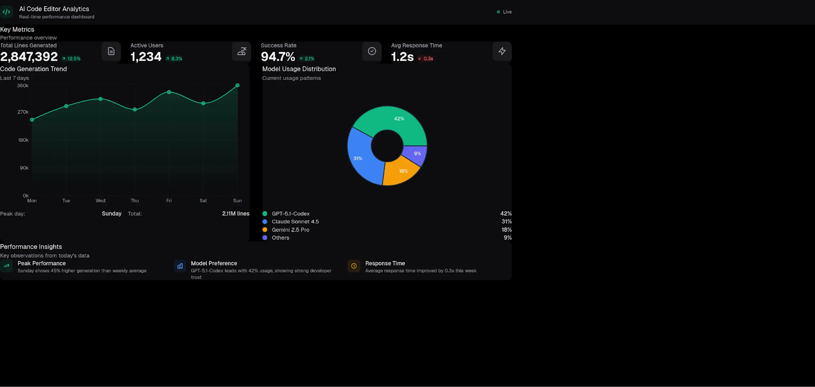
#2 Place: Claude Sonnet 4.5
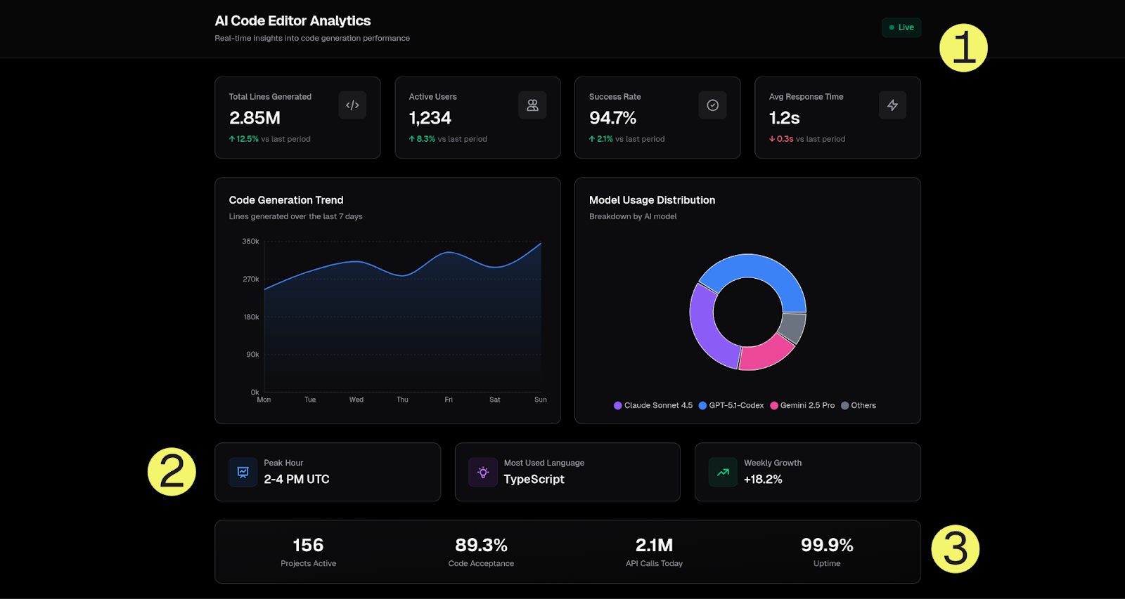
Anthropic’s Claude demonstrated restraint; it knew what to add and what to skip. Let us explain.
What we liked about this dashboard
1. “Live” Indicator (top right)
This was an animated pulse dot with a “Live” label.
2. Additional Insights (3 Cards)
These were helpful insights that could help users make informed decisions. Things like:
Peak Hours (for model usage): 2-4 PM UTC (reasonable extrapolation)
Most Used Language: TypeScript (which could correspond to real data)
Weekly Growth: +18.2% (logical additional metric)
3. Footer Stats Bar
This was a nice touch that showed stats like:
Projects Active
% Code Acceptance
# of API Calls Today
% Uptime
These were all relevant stats to code editor analytics.
All these features/stats showed that Claude Sonnet 4.5 is pretty good at understanding context.
Code length: ~200 lines. Clean component structure, full-width charts.
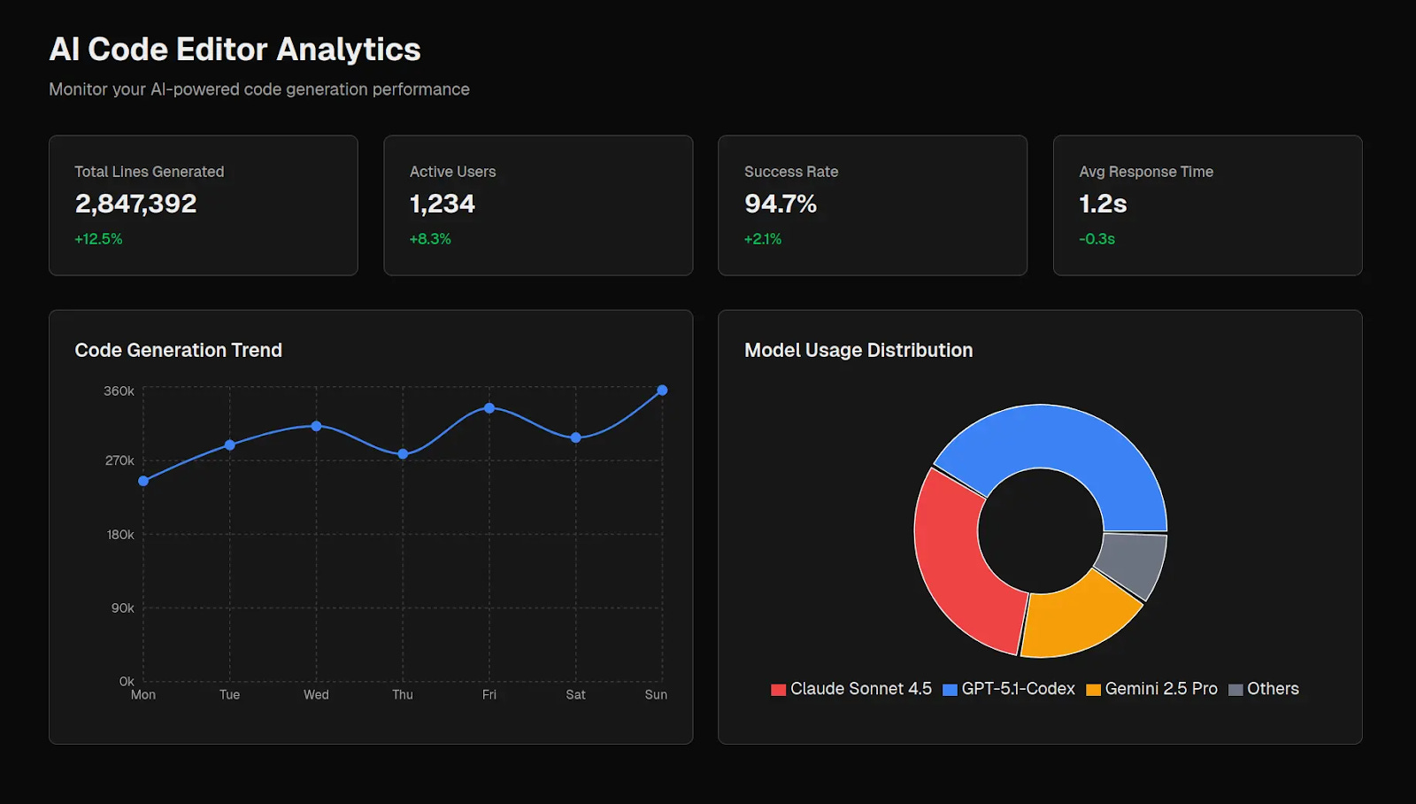
#3 place: Grok 4.1
xAI’s latest model (released 2 days ago) proved that less is more.
A minimalist dashboard with 100 lines
Grok 4.1 delivered a functional analytics dashboard in only 100 lines of code. Unlike other models, there were no buzzwords, irrelevant features or overengineering. Instead, we got:
4 metric cards with icons
Area chart (code generation over 7 days)
Donut chart (model usage distribution)
“Last updated: just now” timestamp
This is enough for an MVP version of a dashboard.
Grok 4.1’s Philosophy: Show exactly what was asked, nothing more. No BS. This is the anti-AI-slop approach.
GPT-5.1-Codex over-engineered the dashboard
OpenAI’s GPT-5.1-Codex added the most features (341 lines of code) but they were largely irrelevant to what we wanted.
Feature-rich or AI slop?
GPT-5-Codex failed in two different ways:
Wrong Context Features
These features usually belong in different dashboard types:
“Trigger safe-mode deploy” button - This is a historical analytics dashboard showing past 7 days of data. Deploy buttons typically belong in CI/CD dashboards or ops control panels, not analytics.
Queue depth: 12 req - Would make sense in a real-time ops dashboard monitoring active workload. For historical analytics, you’d need time-series data (queue depth over time), not a single snapshot number.
Active sandboxes: 248 - Usually belongs in a cloud infrastructure dashboard tracking resource usage. A single number isn’t that useful for 7-day analytics.
Error budget: 94% remaining - This is an SRE (site reliability engineering) concept for site reliability dashboards. No context for what SLO (service level objective) this tracks or how it relates to code editor analytics.
The pattern: GPT-5 copy-pasted concepts from ops/SRE/infrastructure dashboards without considering if they fit this dashboard’s purpose (analytics for a code editor).
Invented Metrics Not In The Prompt
These are good ideas conceptually, but GPT-5 made up metrics that don’t exist in the provided sample data:
“Success Funnel: Compilation 98.1%, Tests 93.4%, Ship-ready 88.7%”
Would show code quality, not just quantity. Answers “GPT-5 generates 42% of code, but how much of that was actually shipped?”
The prompt only gave total generations, active users, success rate, and response time. GPT-5-Codex invented the funnel stages and percentages.
“Deep work window: 72% of lines generated between 09:00-14:00 UTC”
This is good idea on paper: Show usage patterns valuable for capacity planning
The problem: There was no hourly breakdown in the prompt data to calculate this
Here’s what’s interesting: Here’s what’s interesting: The success funnel shows GPT-5-Codex understands code quality matters. We consider this a more sophisticated failure case.
If the prompt had provided compilation/test data, the quality funnel would probably be the best feature in any dashboard. But coming up with metrics we didn’t provide in the sample data made us classify this mostly as AI slop.
The lesson: GPT-5-Codex optimized for “sounding impressive” over “being accurate.” This is a common problem with AIs; they sound impressive, but if you take a deeper look, you’ll start seeing flaws.
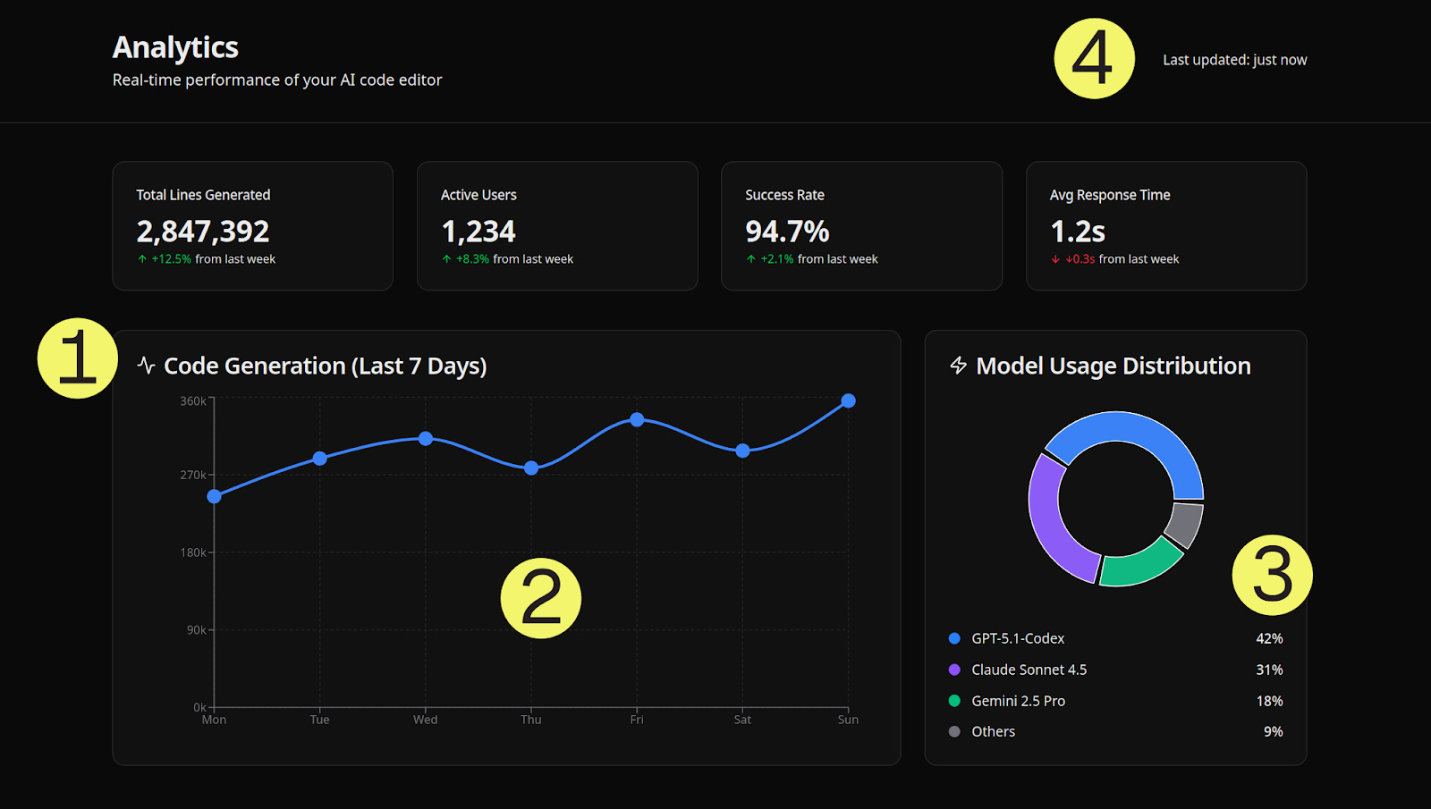
Dashboard metrics: Gemini 3 Pro vs. GPT-5-Codex
Let’s compare GPT-5’s “Command Center” to Gemini 3’s “System Events Table”:
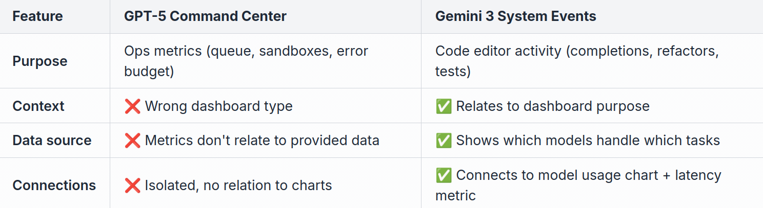
The key difference: Gemini 3 added features that relate to the provided data. GPT-5 added features that usually belong in different dashboards.
Functional But Basic: Grok Code-Fast-1
xAI’s Grok Code-Fast-1 sits between GPT-5’s overengineering and Grok 4.1’s polish. It’s fully functional with working colors, charts, and a clean layout - but lacks the refinement of its sibling model (Grok 4.1).
What we liked:
Clean execution - All colors, spacing, and layouts render correctly
Both charts were functional - The line chart and the donut chart display correctly
Minimal like Grok 4.1 - No bloat, no invented metrics
Professional dark theme - Consistent design language
What was missing vs. Grok 4.1:
Less appealing pie chart - Grok 4.1’s version better communicated the model distribution
No meaningful icons - Metric cards lack visual hierarchy that Grok 4.1 provides
The verdict: Grok Code-Fast-1 proves minimalism works, but Grok 4.1 shows that minimalism + polish can be even better.
2 Out of 7 Models (Partially) Failed with Tailwind v4
29% of models failed due to Tailwind v4 knowledge cutoff. Two models (Gemini 2.5 Pro and MiniMax M2) used outdated Tailwind v3 syntax.
MiniMax M2
MiniMax did better than Gemini 2.5 Pro (colors worked, charts rendered, and the performance insights cards were visible.) However, padding and spacing were broken. The content was cramped to the left edge with no margins.
The root cause was mixing up Tailwind v3 and v4.
Gemini 2.5 Pro
Google’s previous model produced unstyled output. Ugh…
What this shows: Training recency matters more than model size when using cutting-edge frameworks (Next.js 15, Tailwind v4).
A huge upgrade: Gemini 2.5 Pro (released 8 months ago) basically produced an unusable design, but Gemini 3 Pro Preview (released yesterday) won 1st place. Training data recency makes a big difference when it comes to frameworks that update often.
Final Rankings
Note: MiniMax M2 is a pretty good model when it comes to backend tasks. We’ll release a blog post about this in the next few days.
Code Length Comparison
More features ≠ better. Here’s the proof:
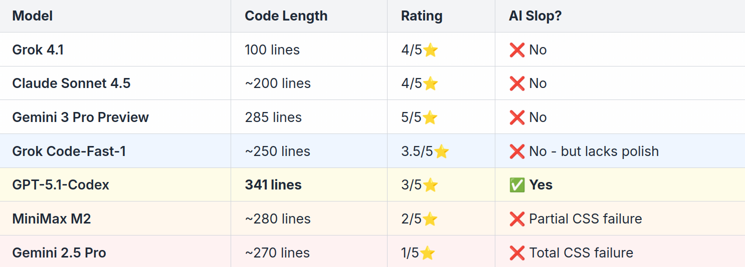
GPT-5.1 wrote 3.4x more code than Grok but ranked lower. Code length is not a quality indicator.
Key Takeaways
What We Learned
More features ≠ better
GPT-5’s 341 lines lost to Gemini 3’s 285 lines because quality often beats quantity.Two types of AI slop exist:
Type 1: Wrong context (deploy buttons in analytics dashboards)
Type 2: Invented metrics (good ideas but made up numbers not in the prompt)The nuance matters
GPT-5.1’s quality funnel was conceptually brilliant, showing sophistication beyond random buzzwords. But inventing metrics not in the prompt still makes it AI slop.Training recency matters
Gemini 2.5 Pro (it’s becoming an “older model”) failed completely on Tailwind v4. Gemini 3 Pro Preview (released yesterday) won 1st place.Thoughtful additions > overengineering
Gemini 3 and Claude’s approach: add value without noise. Every feature serves a purpose.Sometimes minimal is best
Grok 4.1’s 100 lines prove you don’t need complexity to be effective.
What this means for you as a developer
When evaluating AI-generated UI/UX code, watch for these warning signs:
Metrics that don’t relate to your data - Is the AI inventing numbers that don’t exist? For example, something is off if the dashboard implies that Rust is the most popular programming language.
Features in the wrong context - Does a “deploy” button make sense in an analytics dashboard?
Buzzword overload - “Production Intelligence”, “AI CODE OPS” often add no value to UI design. This often signals the prompting scope being too vague.
Code length as quality - 341 lines isn’t necessarily better than 100 lines if 241 lines aren’t relevant features
Wrong dashboard type features - Examples: Ops metrics in analytics dashboards, infrastructure metrics in editor analytics
The lesson: Don’t only judge AI-generated code by feature count. Judge by how well the features connect to the actual purpose.
Credits: Thank you Max Skridlevsky for helping with the benchmark & analysis.